Vittles Vault
A Petmate brand specializing in airtight pet food storage containers.
role
tools
skills

Observation:
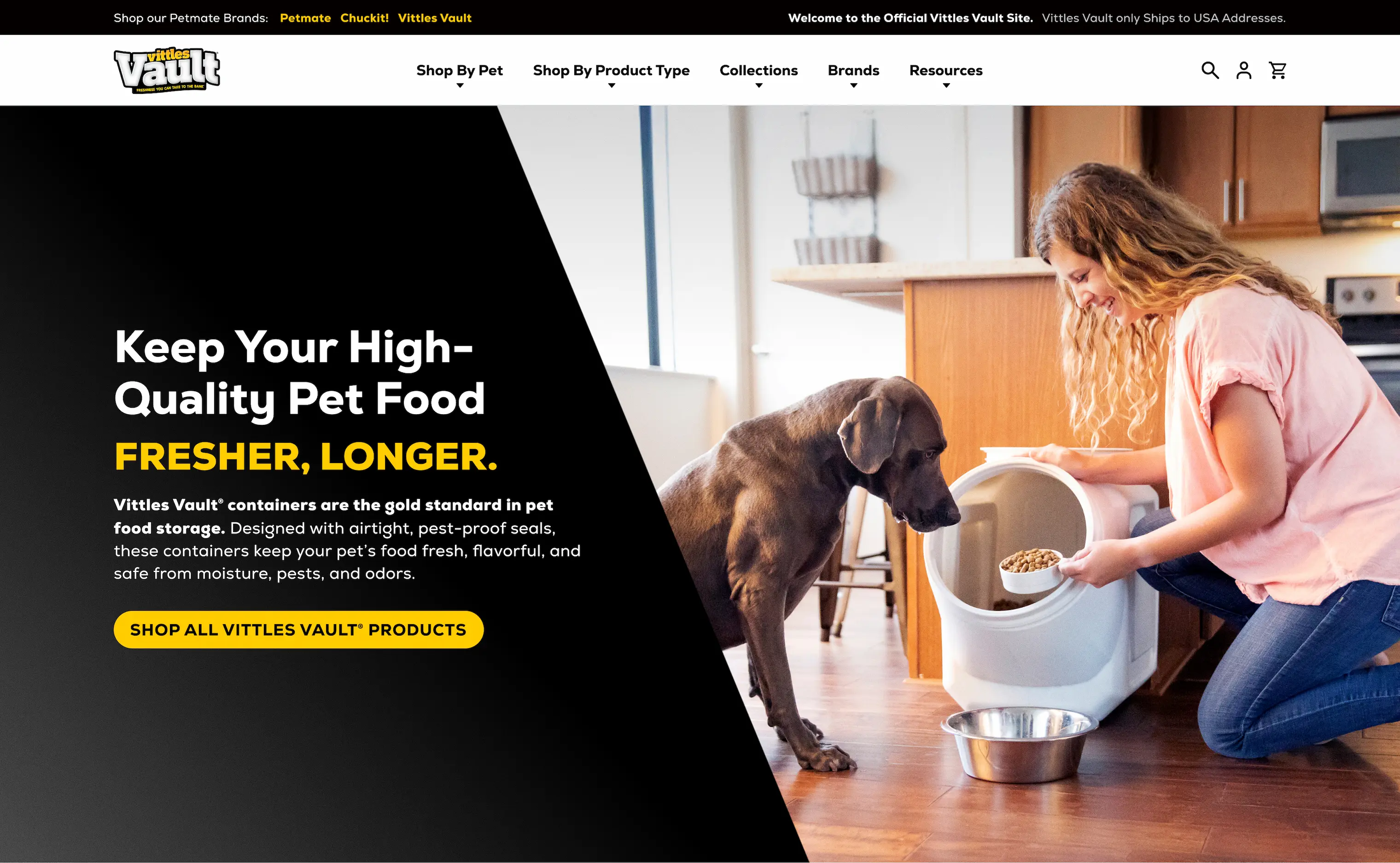
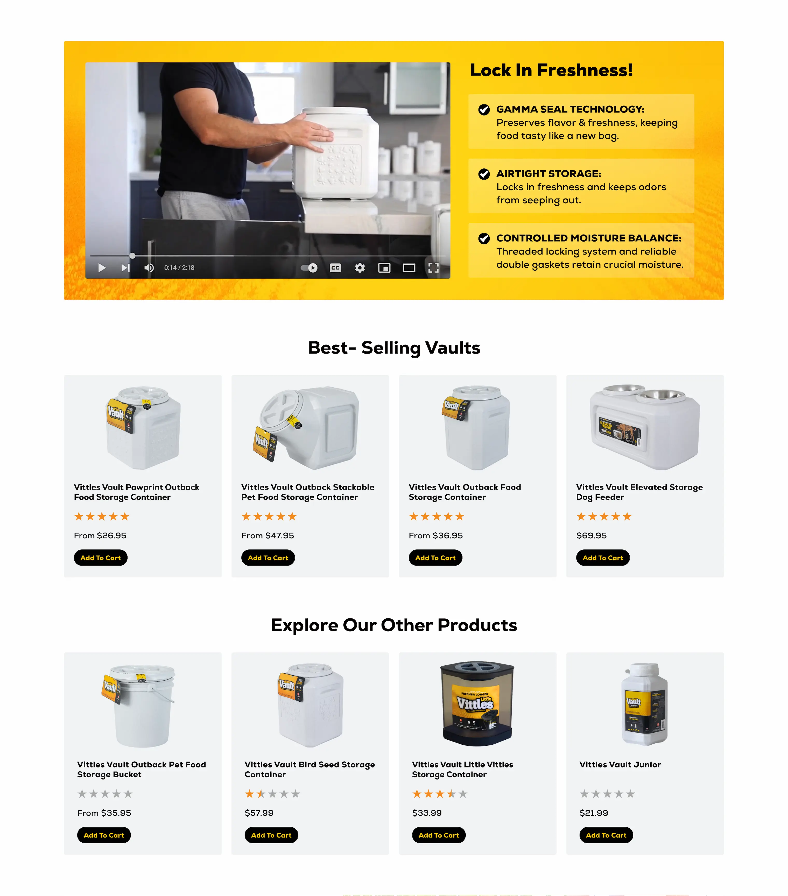
Vittles Vault's branding has a clear visual identity: a bold, high-contrast color palette and a signature texture. Orange and yellow product labels that look confident and intentional. None of that was coming through on their website. The existing design had drifted toward Petmate blue — their parent brand — and the product photography they were using wasn't carrying the brand forward. Unbranded white containers with an embossed pattern. No color, no label, nothing to tell you this was Vittles Vault and not just a generic warehouse listing.
Approach & Result:
The fix started with the photography. Vittles Vault's branded containers — ones with colorful labels that actually say Vittles Vault on them — were already in their digital asset library. Pulling those in changed the entire feeling of the page. From there the design leaned into what the brand already had: high-contrast colors, the signature texture, a clean structure that made a small catalog feel considered rather than spare. Built on the Shopify platform. The result is a storefront that feels like the Vittles Vault brand all the way through.



See My Other Projects


Let’s work together.
I hope you’ve had a chance to explore my portfolio and had a pleasant experience. If you think I’d be a good fit for your team or the sole designer for your company, let’s set up an interview. Don’t hesitate to reach out with questions, concerns, or even idle chit-chat. Take care, and thanks for visiting.